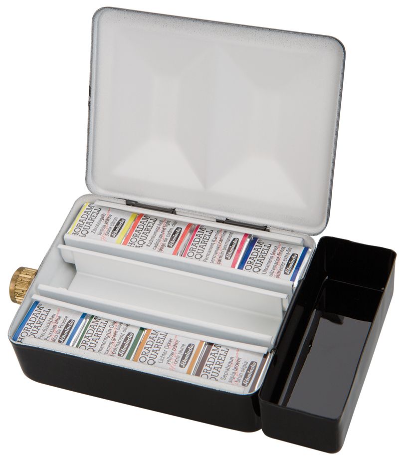
Color Freeze
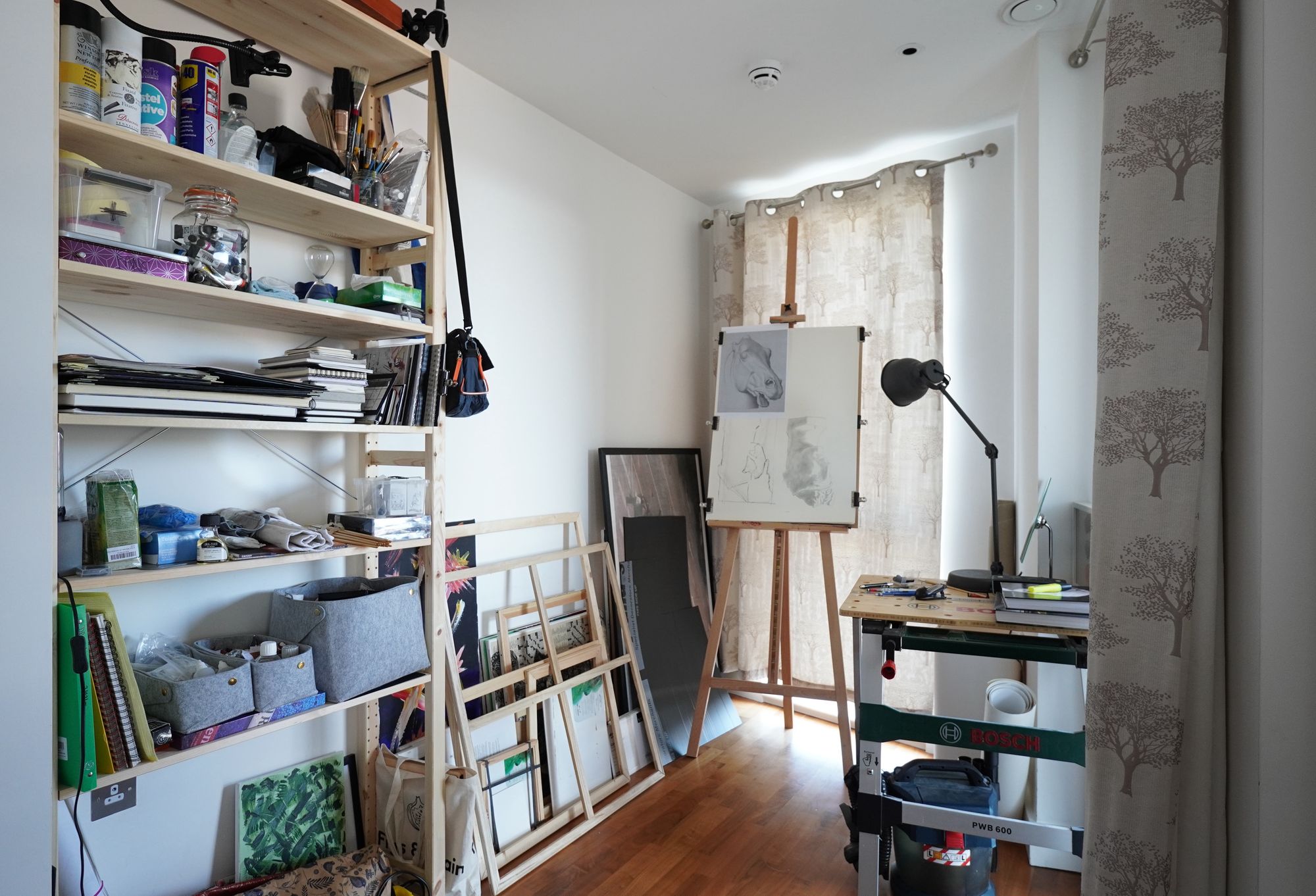
Hey, welcome back. My palette has slowly transformed over the last few weeks from when I published that post about my full sized paint box. I've actually been using another, smaller box almost exclusively that I've made some modifications to but that's for another post. Initially, I used the same colors in the small box as I was using in the full sized one from the post but over the weeks made the following modifications:
- I got rid of raw umber since I rarely used it and it's hard to get out of the pan.
- I removed the permanent rose since I couldn't really tell it apart from the alizarin crimson.
- I added phthalo blue and green back in (but ended up not using them much). If you look closely at the labelling in my previous post, you can see that these were initially part of the palette but I'd already taken them out by the time I took the picture for the post.
I've been spending a lot time on cassart.co.uk and various watercolor artists' blogs in the last few days and I have some new thoughts on stuff to try. At the same time, I think it's time to choose a set of colors and get familiar with them, rather than chasing paints. To this end, I'm instituting a color freeze until August 1st. Liz Steel suggests doing this on her blog and I think it's just what I need right now.
Since today is the last day I'm allowed to make changes in a few weeks, I made some last minute tweaks:
- I got rid of cadmium yellow and cadmium red. I didn't like how opaque they are and I also found them to be somewhat artificial looking. That's probably because I didn't mix them enough but anyway, for the next 6 weeks they are gone.
- I put raw umber back in. I want to use more earth tones and push myself a little with it.
- New reds and yellows! Only the blues have stayed the same.
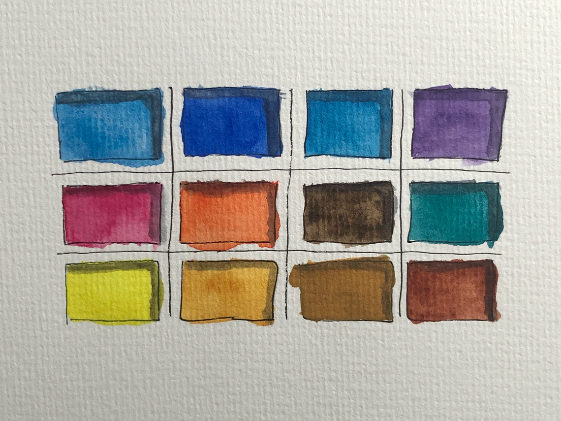
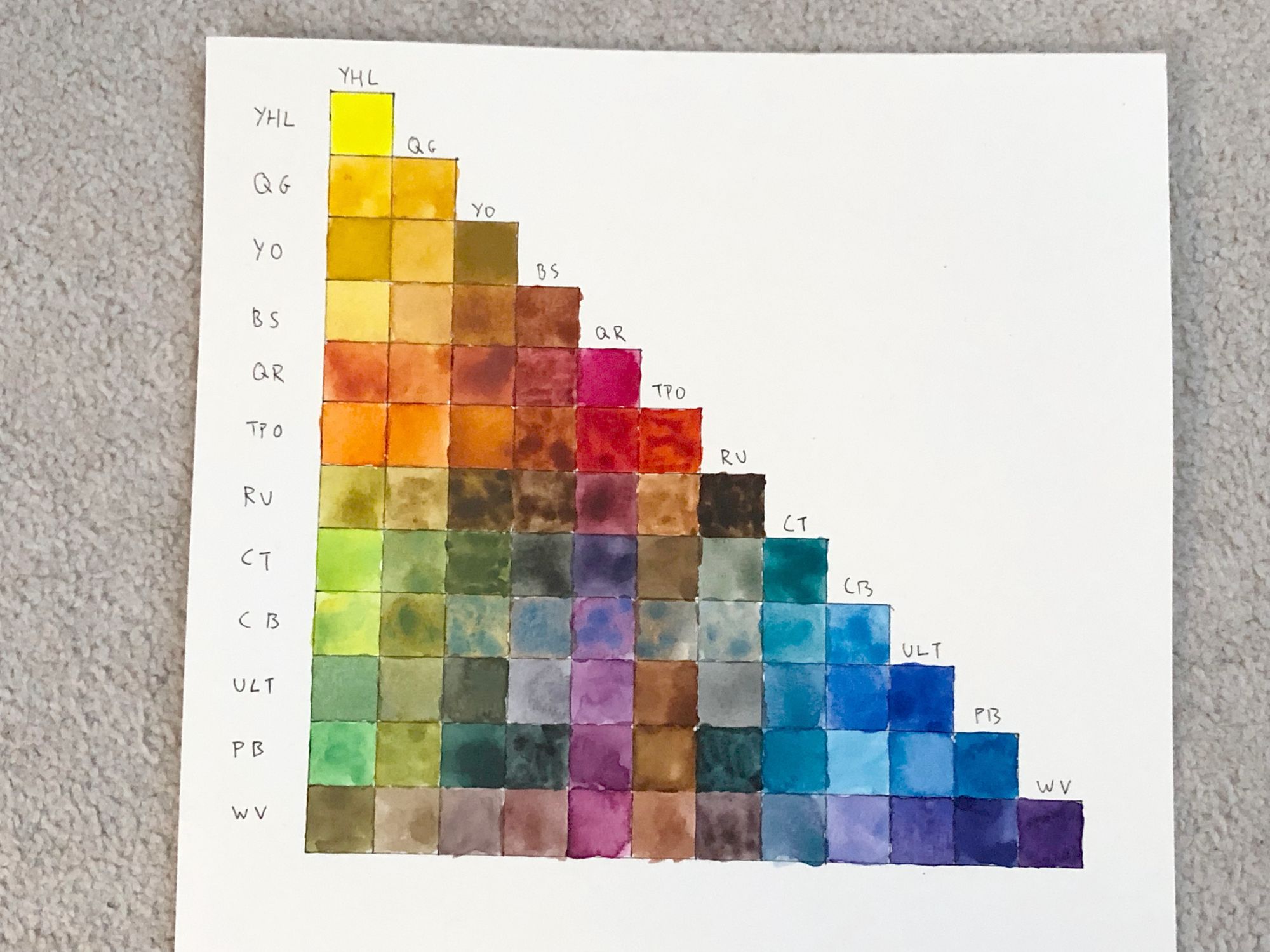
So what's in my palette now? These are the 12 I chose:
- Yellow Hansa Light (DS): I like this color and in the swatch I made, it mixed well with the other colors that were on my palette at the time, I hope the same is true of the colors I've now chosen.
- Quinacridone Gold (DS): I've seen a lot of people rave about this color and I've been wanting to use it for a while. This is my warm yellow. I had new gamboge on there first but I've been too curious how quinacridone gold feels not to play with it a little.
- Yellow Ochre (Schmincke): Since quinacridone gold doesn't feel very "yellow" to me, I wanted another yellow-like color on my palette and chose this over raw sienna.
- Burnt Sienna (DS): I mostly use this to mix it with ultramarine to make gray but I want to start using this color more for other mixes.
- Quinacridone Rose (DS): It was between this and alizarin crimson for me and I like how this color looks lightly applied.
- Transparent Pyrrol Orange (DS): This is another color I've seen recommended again and again and it's my replacement for cadmium red. This is the color I'm least sure about because it really does look very orange to me right now and I'm not sure if I'll have enough red on my palette to draw truly red things.
- Raw umber (DS): Like I said above, this is a color I want to force myself to start using. I really want to expand away from pure tones into the gray, the dirty, the muddy.
- Cobalt turquoise (W&N): This is my wildcard color. Both Lapin and Liz Steel talk about how much fun this color is to use. The idea of having one or two wildcard pans on my palette to fill with fun colors is another one I got from Liz Steel's blog.
- Cerulean Blue (W&N): I use this for skies, mostly. This is my cool blue. In Light in Watercolor, Lucy Willis describes how she mixes this with winsor violet to make gray, definitely something I want to try.
- Ultramarine (Schmincke): Maybe my most used color.
- Phthalo Blue, Green Shade (DS): I wanted to keep at least one phthalo. I like how intense this color is and it seems to produce interesting mixes.
- Winsor Violet (W&N): Besides ultramarine and raw sienna, this is the color I've mixed paints with the most. I find that it loses its "violetness" very quickly once it's added to another color and Lucy Willis seems to use it a lot for her shadows, something I'm actively working on right now.
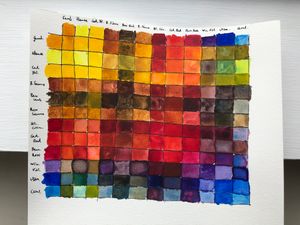
So there it is, my list of paints for at least the next six weeks. Once the new colors have dried on my palette, I'm going to make a swatch and see how they mix!

